Designing an Alphabet from Scratch
Guest post, anonymously submitted
“If you want to create an apple pie from scratch,
begin by creating the universe.”
Carl Sagan
Note: This article was written to benefit from the Discount Deal.
Designing an alphabet can be quite an undertaking. The subject of the history of writing alone is profoundly deep and is only one among many other deep areas of study: graphology, linguistics, philology, phonetics and sociology, to name only a few. Fundamentally, alphabets are generally historical artefacts and the shapes involved often derive from earlier forms, which have mutated or been modified down the years. (There are many exceptions to this: for example, both the Cherokee syllabary and Canadian Aboriginal syllabics were initially developed in the 19th Century, and the Pahawh script in the 20th Century.) Characters can also be borrowed from other languages, either piecemeal (for example, Cyrillic includes numerous Greek characters) or wholesale (as in Japanese, which borrows its ideographic symbology, the kanji, directly from Chinese languages).
If we put aside for now the historical and social aspects, the shapes of the glyphs themselves can be considered as fundamentally arbitrary, certainly for the purposes of this discussion. The reason that we see ‘a’ and associate that with a certain sound is down to education and standardization, beginning long ago and much reinforced in later times: first, for example, by the scribes of the court of Charlemagne, and later by the work of a certain goldsmith from Mainz in the 15th Century.
Since this post is about alphabets, I’m not going to discuss logographic writing systems. Fundamentally, a lot of the same ideas apply, but I’d like to try and keep this post reasonably short. I’m going to start by describing four different kinds of ‘alphabets’ – I’m going to refer to them as ‘writing systems’ from now on, since that’s a more accurate term – and then discuss a few ideas and concepts I keep in mind when I think about building a writing system, followed by a short section of notes on things to watch out for.
Types of Alphabets
An alphabet is the standardised collection of written symbols representing the phonemes of a spoken language. This is the basis of writing systems most similar to European languages. Before we go any further, though, I’d like to delve into a little bit of background – only briefly, I promise! The point is that while we often talk about ‘alphabets,’ in strict terms ‘alphabet’ refers to a particular way in which sounds are represented on the page. I’d like to describe four different ways of organising characters: the alphabet, the abjad, the abugida, and the syllabary.
Alphabet
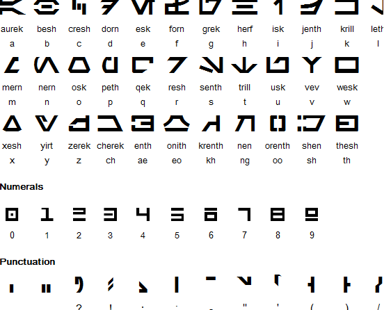
In an alphabet, each individual letter (or grapheme) represents a single sound (phoneme) in the spoken language. This is the case for the Latin alphabet (the one I'm using now). It’s also quite common in science fiction and fantasy: for example, the Star Wars ‘Aurebesh’ (seen here to the right) is an alphabet, as is the Dwarven ‘Cirth’ from The Lord of the Rings. In both cases, there are the same number of symbols as there are phonemes in the language (however many that may be).
Abjad
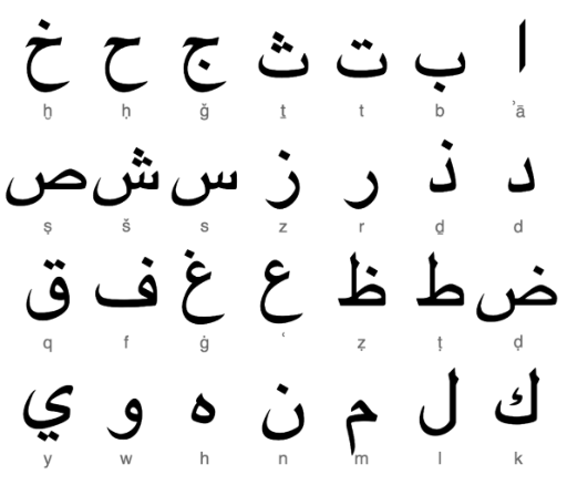
An abjad differs from an alphabet in that only consonants are directly represented, and vowel sounds are left to be inferred by the reader. This is fine if the reader is familiar with the language and its pronunciation has not changed over time. To overcome this problem, it’s not uncommon for an abjad to include diacritics to indicate vowel sounds: some even contain a small number of vowel glyphs mixed into the rest of the symbols. Examples of real-world abjads include Hebrew and Arabic. Perhaps the best well-known fantasy abjad is the Elvish script ‘Tengwar’ from The Lord of the Rings.
Abugida
In the alphabet and the abjad, all characters in the set have equal value. (Diacritics are ignored unless a character with a diacritic is a character in its own right; e.g. ‘ñ,’ ‘ç,’ and ‘ë.’) In an abugida, vowel sounds are considered secondary to consonants, and they appear as modifiers on characters representing consonants. This does not mean that they can be omitted, however, as in an abjad. Further, each consonant in an abugida has an ‘inherent vowel,’ which is modified by the glyph attached to the character.
For example, imagine a language with the consonants p, t, r, s, m, k, and v, and let’s say that the inherent vowel – which every consonant has, even though it’s not explicitly written – is a flat ‘a’ (as in ‘hat’). Now, we add a few modifiers to represent vowels:
| ˆ | ‘a’ to ‘ay’ | ŝ | ‘sa’ to ‘say’ |
| ˊ | ‘a’ to ‘o’ | ḿ | ‘ma’ to ‘mo’ |
| ¸ | ‘a’ to ‘e’ | ŗ | ‘ra’ to ‘re’ |
Though this is a very simple example, it will hopefully give you an idea of how the components of an abugida function. Real world examples of abugidas include Bengali, Tibetan, Ge‘ez (Semitic Ethiopian), and Canadian Aboriginal syllabics. The only example of a fictional language which might use an abugida – and I say ‘might’ as I’ve yet to see it written – is the ‘Judoon’ language from Doctor Who, which seems to have only one vowel, ‘o’. I’m also working on the assumption that there are subtle inflections to this sound (such as pitch, duration, or other subtleties of pronunciation) which could be indicated by modifiers.
Syllabary
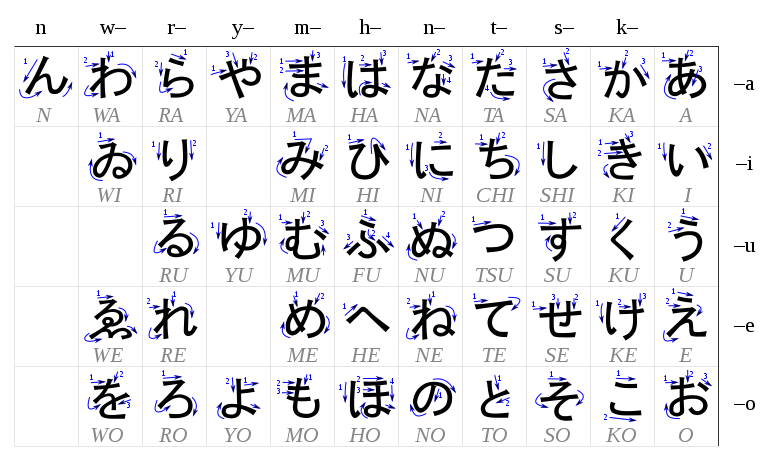
Finally, the syllabary. Related in some ways to the abugida, in a syllabary each consonant is paired with each vowel sound to create a complete matrix of available sounds. Individual vowel sounds have equal weight to the consonants, and there may be consonants without a terminal vowel. The most obvious examples of a real world syllabary are the Japanese hiragana and katakana.
Some Thoughts for Designing a Writing System
There are a lot of issues to consider when you’re designing an alphabet, whether you’re designing characters from scratch or using already existing symbols. (I’ve written a short section about that below as it deserves a little dedicated attention.) Here are a few that come to mind first when I’m thinking about creating a writing system. Note that nothing here really relates to the language: that’s a whole different set of issues.
Type of Writing System
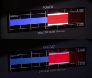
One of the first decisions to make is the kind of writing system that you want to use to represent your language. In the case where you’re turning a real world language into a set of alien glyphs (as was done with the release of the Star Wars special edition: in the image, the top is the original and the bottom has been changed to use ‘Aurebesh’), it’s probably the easiest to use an alphabet with a direct one-to-one mapping from the original characters to the new one. That’s not to say that you can’t replace one writing system with another: it’s just a bit trickier to keep things tidy, and you may find you have to make some compromises.
Shape & Style
While characters themselves can be largely arbitrary in design (though see below), it’s important to remember that their shapes have a history and would originally have been created with whatever tools were available. This doesn’t mean they can’t have been simplified over time (see below): still, it’s important to give a bit of thought to the history of the culture which created them. For example, a language used by dragons might have been created using their foreclaws to scratch marks in trees or the ground; a creature like the Horta (from Star Trek again), which exudes acid from its body to tunnel through rock, might be capable of creating splash patterns to represent individual characters, which could perhaps be read in a manner similar to Braille. A warlike race could have a writing system with very sharp, clearly differentiated characters, perhaps originally designed to be stamped or cut into metal; another society with a music-based language could have a more loose, flowing writing system which indicates pitch and duration.
The (Non-)Arbitrary Nature of Shapes
Here’s a paradox for you: the shapes of characters can be both entirely arbitrary and entirely intentional (i.e. non-arbitrary) at the same time. We can start to unpick this paradox with the question, “Why is this letter the shape it is?” To answer that, let’s consider a standard example, the Latin character ‘A’. According to current understanding, it began from a picture of an ox’s head and evolved to the shape we’re familiar with, largely through a process of simplification. So, now we can ask the question, “Why an ox’s head?” And the only real answer that I can give with any certainty, not being an expert on this, is: “… why not?” Why the Ancient Egyptians assigned the ox a name beginning with the letter ‘a’ is entirely inscrutable at the distance of 5,000 years: it just is. Hence the paradox: a character is both arbitrary and non-arbitrary at the same time.
The reason I bring this up is to underscore the importance of striking a balance between a position of rigour in the design of the symbols and feeling free to assign shapes without worrying too much about the whys and wherefores.
Clarity
This may seem like a minor point compared to others, but it can often be overlooked. By ‘clarity,’ I mean how easy it is to distinguish one symbol from another with minimal effort when they are written without intentionally making them obscure. If all your letters look very similar it can be difficult to read; equally, strangely enough, if all your letters are dissimilar it can have a similar effect, at least to begin with.
Readability & Writability
Related to Clarity but a little bit different. Consider that, for most circumstances, it’s preferable to spend as little time on a task as possible, and especially so when a task is repetitious. If a set of letters is difficult to write, it will evolve so that it becomes easier – that is, usually, less time-consuming – to write. (For example, Ancient Egyptian evolved into three separate scripts: hieroglyphics, for ceremonial purposes; hieratic, a script used by scribes; and demotic, a common script that was quick to write.) At the same time, any script has to be appropriately easy to read for its target audience.
Text Direction
Where on a page does the text begin, and how does it flow along the page? In most Western writing systems, and many others, text begins at the top-left of a page and lines are read left-to-right, whereas Middle Eastern languages begin at the top of the page and are read right-to-left. Asian languages common are read vertically and right-to-left. (Ancient Egyptian was written in boustrophedon, in which each line flows in the opposite direction to the one above it.) Changing the writing direction of a script can have a profoundly alienizing effect. As always, though, it’s useful to bear in mind the psychology of the species creating the writing system: the question is, “Why would they write in this manner?” The answer to that question can be surprising, and it’s rarely as obvious as it might seem.
Punctuation
This aspect of designing a language can be overlooked, and it’s a shame because without it a language can lose quite a bit of its subtlety. The most obvious points here are how to distinguish proper nouns and how to indicate the beginning of a new sentence (or the end of an old one, depending on your point of view). I would say that these two are vital to any writing system, otherwise the text becomes one long sentence with no clear structure, and names are undifferentiated (they do not have anything to cause them to stand out to the reader).
Single or Mixed Case
Not all writing systems include two separate cases. In fact, bicameral (mixed-case) scripts are less common than unicameral (single-case) scripts. In languages which have case distinction, it is used primarily for emphasis, and also in accord with the rules of capitalisation for that language (most commonly proper nouns and the first letter of sentences). Note that in bicameral languages, the two forms of a letter are usually distinct: small caps is not the same thing as mixed case.
Special Characters
In some languages, there are special forms of a character which can only occur in certain positions. The one which comes most quickly to mind is the special form of the Greek letter sigma, σ: at the end of a word, it changes to ς. Special symbols which replace a standard character can add an extra layer of interest to a script.
Cursive
The majority of writing systems used characters which are not intended to be connected to others, though individual scripts may develop with characters which permit connections between letters so they may be written in a cursive style. The Arabic language, and those which have developed from it, uses an abjad with predominantly cursive characters. This lends the script a certain fluency and also makes it appear quite different from other scripts in which the letters stand alone.
Numerals
One area which frequently gets short shrift is that of numerals. They form an important part of any writing system, but they are often overlooked or added in at the last minute. The majority of the ideas above apply equally to the characters as to digits; however, there is one point which applies uniquely to number systems.
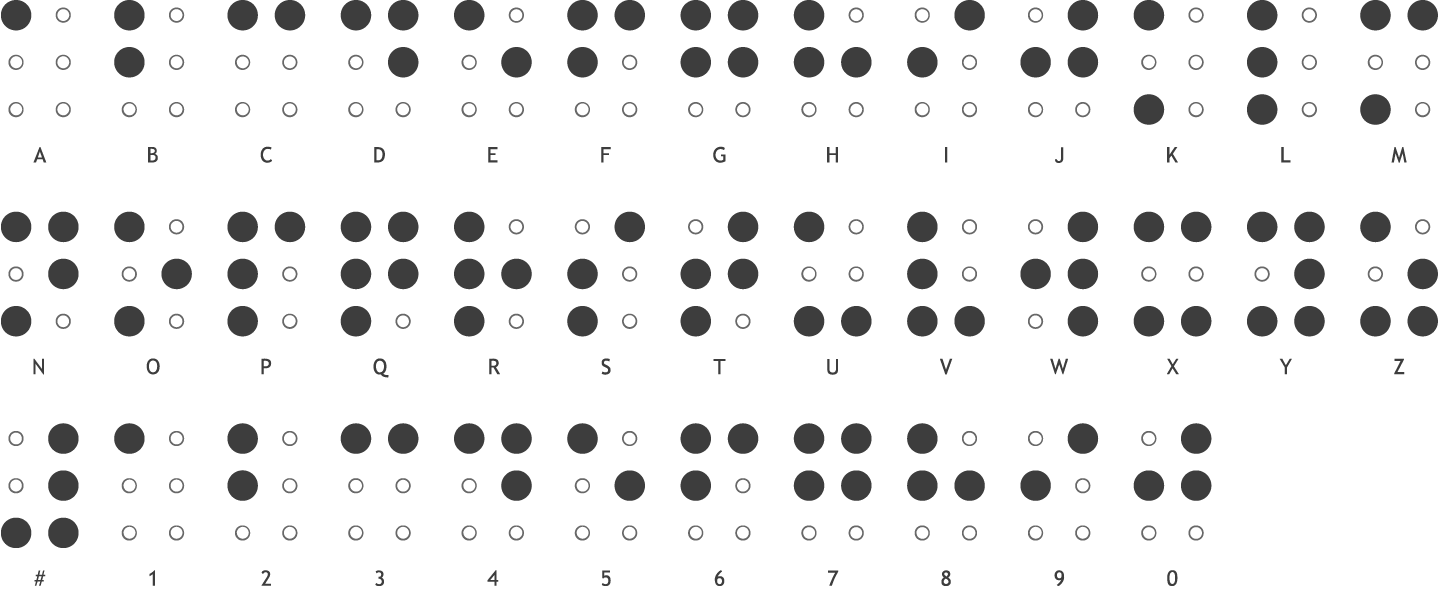
We’re familiar with the Western digit system – 0, 1, 2, 3, 4, 5, 6, 7, 8, 9 – which uses specialised characters to represent values. This works very well and makes it easy to distinguish numerical values from text. (With the possible exceptions of O/0 and I/l/1.) It’s interesting to note, however, that in Ancient Rome there was no symbol for zero: that came later, with the Arabic numerals which replaced the Roman numerical system. Before this, most languages, such as Ancient Greek, Hebrew and indeed Roman, used symbols from their writing system to indicate numbers. In fact, Braille uses the same approach, though it also has a special character (shown at the bottom left of the image) to highlight that the characters following it should be read numerically.
Using Real World Characters
One easy way to create a new writing system is to borrow elements from those that already exist. As I’ve noted elsewhere, writing systems are fluid and often borrow from one another.
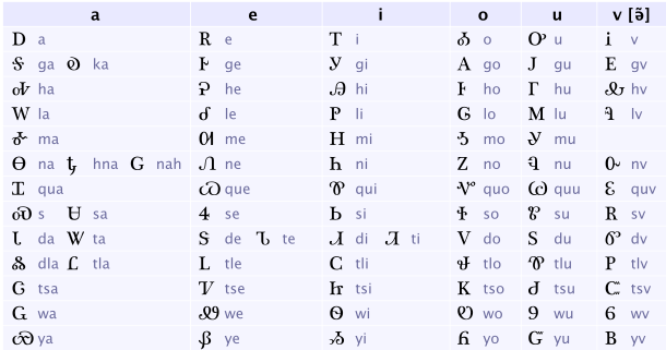
You may think that the image to the right is a writing system for a conlang, but it is in fact a real world system which I’ve mentioned before, the Cherokee Syllabary. Invented in the early 19th Century by a member of the Cherokee Nation named Sequoyah, it uses numerous characters from other writing systems, most obviously Latin, Greek and Cyrillic, although borrowed characters do not represent the same sounds.
The biggest problem with using real world symbols in a created script is actually one which is quite easy to see with the example above. Language and symbols are often taught early and intensively, and as pattern-matching creatures it can be difficult for humans to see past the meaning we have for a symbol: for example, if there is a symbol ‘E’ in a writing system (or something that resembles it closely) it can be difficult not to see it as representing the sound ‘e’. Difficult, but not impossible. Of course, the more unique symbols surround such a character, and the more the reader is required to view it out of its familiar context, the more readily its new value will be accepted.
Phonetic Substitution
Perhaps this doesn’t really belong in this post as it’s not exactly germane, but it is a quick way of creating the appearance of a new writing system and language.
On the right is a screen capture from an old Doctor Who series, The Invisible Enemy. The part we’re interested in is the text above the door, which reads:
IMURJINSEE
EGSIT
The set designer has been quite clever here: by writing the words in the way that they’re pronounced, they have something of an alien (or, in this case, futuristic) appearance. I’d probably have gone with ‘II’ instead of ‘EE’, though there’s an argument to be made that the ‘ee’ is a separate phoneme from ‘i’; it’s also entirely likely that the font they used didn’t have any characters with diacritics. (More likely that they were a busy set designer and just used what they had.)
Additional Notes
‘Why Bother?’
Why are you creating a new script? What does it bring to the experience of the story? What information does it give us about the world, and the entities who use it? What are you going to show the reader that requires it to be in another script?
These questions aren’t intended to dissuade anyone from creating new languages and writing systems. It’s more to do with the ‘universal translator’ issue, or the strange way in which all aliens mysteriously speak flawlessly and idiomatically in whichever language is spoken by the writer or creator. (Doctor Who has played on this idea in recent years, particularly in the season 4 episode The Fires of Pompeii. The Doctor’s TARDIS is said to telepathically translate language for its users, so when Donna, the then companion, says, “Veni, vidi, vici,” to a citizen of Pompeii, it’s translated as Welsh.) Since any words in the text will likely be in dialogue and therefore heard and not read, there is an argument that those words could simply be written in a standard alphabet. Consider that in The Lord of the Rings, there is no Elvish, Dwarvish or any other non-Latin text in the body of the books: all the ‘Tengwar’, ‘Cirth’ or ‘Black Speech’ script appears in illustrations.
Again, this is not intended to discourage or to dissuade. Creating a new writing system for a story, or set of stories, is a fantastic and fun – and often frustrating! – thing to do. It’s important, though, to use it carefully.
Keeping the Original Text
Make sure you have a copy of the original text before you convert it into your new writing system. This may seem obvious, but it’s surprising how many times it gets forgotten or overlooked. Having an easy-to-read version of the text can save a lot of time and effort when it gets to the editing stage. Indeed, I’d go so far as to say that converting your placeholder text into any invented writing system is about the last thing that should happen to your manuscript.
Editing
I recommend that you keep a plain-text version of the manuscript. Editors may wish to read it in preference to the other version, and when it comes to editing (and there is always editing to be done), any changes and alterations will be much easier to manage.
Conclusion
Gosh. Even though I wanted to keep this blog post short, it’s still turned out rather long.
One reason I’ve kept it short is because there is so much material available online about the construction of conlangs and writing systems for them: to try to condense it all into a short blog post would be next to impossible. What I have hoped to do is to outline some starting points and some of the issues I have thought about in the past when creating writing systems.
I hope you have found this interesting, and I hope you may find it useful. Thank you for reading.
Credits
Title image of and by Overflo-Stock, and used with their kind permission.
